Good Afternoon Everyone!
Since this is a blog dedicated to the learning experience, I am going to be sharing a lot of first projects. As I do have some backgrounds in drawing and other vector design software, my learning curve may not be as steep as others but I am still learning so please be gentle with comments.
I am working hard at vector drawing in Inkscape and I decided to work on drawing an illustrated version of a picture.
I started with a picture of Mila Kunis I found around the interweb. She has very large features and I thought she would be a great subject to illustrate.
I started with this tutorial on how to draw a vector image from a photograph.
It is extremely helpful to get you started but after a while I kind of went on my own tangents. I did not want my image to look exactly like the original so I changed things slightly with the eyes and the nose.
The nose caused a lot of issues and I am still not sure if I have it completely figured out but to help me get this shape I used a generic nose vector and then changed it to my liking.
So with all of that said this is what I came up with. I know it is not perfect but it is a start, it is my first and I am really happy with it.
Teaching Myself Graphic Design
New Graphics Added Weekly
Wednesday, August 26, 2015
Tuesday, August 18, 2015
Decorative Black and White Cirlces
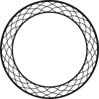
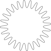
I decided to play around in Inkscape for a little while today and I came up with all of these different black and white circles. These graphics are free for you to use on your website or other work as long as you credit this website and myself. You may also manipulate any of the graphics found on this page.
All of these images are formatted .PNG and consist of only lines. The backgrounds on these circles are transparent to allow for full customization. They can be used in your favorite graphics software, word processor, or
I was pretty happy with what I came up with. Some of these were created by using the polygon tool with modified inputs and some of these were just created with layers of different circles.
Right now I am working on building elements that will be used in feature designs and I figured the perfect place to start would be circles.
Let me know what you think of these in the comments section and thanks for stopping by my blog.
 |
| This circle has the look as though it had been stitched and would be perfect for various badges. Particularly on a craft or sewing blog. This badge is also available in different colors and textures. |
 |
| This is a variation on the stitched circle above. This one has accents that look similar to feathers. |
 |
| Feather circle with stitches, inverted colors. |
Here is what I came up with.
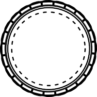 |
| Spoke Edge Circle with Stitching |
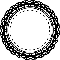 |
| Doily stitched circle. This badge has a lacy border. |
That is all I have come up with today. Check back later for more graphics. Hopefully I will have time tomorrow to pick another theme and let my creativity flow as I did today. If you are interested in learning how I made one of these circles let me know. I am thinking about doing some tutorials but I am not sure what I should focus on, what people really want to learn. I love to write tutorials when I am learning something new because it really cements the process in my head. Many people say the best way to learn something is to teach it and I really hold that true.
As always, if you like this post or think a friend might, be sure to share!
Subscribe to:
Comments (Atom)

